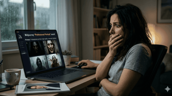










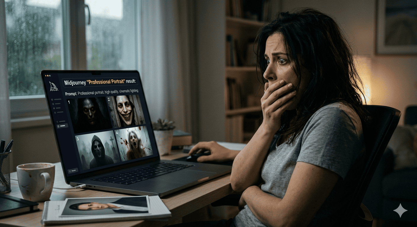
I need to tell you about my first week with Midjourney.
I’d seen the beautiful images online. Everyone was making them. I opened the Discord, typed my first prompt—”professional portrait of a businessman”—and stared at the result in genuine confusion.
It looked like a stock photo had been fed through a fever dream. Exaggerated features, surreal lighting, something unsettling in the eyes. Not what I wanted. Not even close.
I tried again. “realistic portrait of a businessman.” Worse. “professional headshot, realistic, natural lighting.” Now it looked like an AI-generated uncanny valley nightmare.
I spent $30 worth of generation credits and ended up with nothing usable. Deleted my account. Rejoined two weeks later. Tried again.
This time I learned how it actually works.
Midjourney doesn’t generate what you describe. It generates what it thinks you mean. The difference between those two things is everything.
Here’s the guide I wish I’d had that first week.
How Midjourney Actually Thinks About Your Prompt
Most people approach Midjourney like a search engine. You type words, you get images. That mental model will cost you hours and credits.
Midjourney is more like an interpretation engine. You give it raw material to work with—concepts, references, styles, moods—and it makes decisions. Your job isn’t to specify every detail. Your job is to guide the interpretation.
The biggest mistake beginners make: they over-describe what they want to see and under-describe how they want it to look. They say “a cat on a couch” and then wonder why they got a hyperrealistic cat, a cartoon cat, a surrealist cat, and a weirdly unsettling cat all in one grid.
The structure that works: subject + environment + style + lighting + composition.
That’s the formula. Most “bad” Midjourney outputs are really just prompts missing one or more of these elements.
Here’s a real example that improved my results immediately:
Bad prompt: “woman in garden”
Better prompt: “portrait of young woman, sitting in overgrown garden at golden hour, soft-focus background, editorial photography style, natural window lighting, 85mm lens look”
The second one tells Midjourney not just what to show, but how to show it. That’s where the quality jumps.
The Style Parameter (And Why Most People Ignore It)
Midjourney V8 introduced what they’re calling style controls, and they’re genuinely powerful. Most people either don’t use them or use them wrong.
The --style parameter has several modes. I’ll focus on the ones that actually matter for the work most people are doing.
--style raw removes Midjourney’s default aesthetic filter. By default, Midjourney makes things beautiful. That sounds like a feature. Sometimes it is. Sometimes you want something raw, documentary, unpolished—something that looks like it exists in the real world rather than in a curated gallery.
Here’s when I use --style raw: editorial photography, street photography, realistic portraits, documentary work. Anything where the beauty is a distraction from the truth.
Here’s when I skip it: concept art, illustration, anything stylized. The default Midjourney aesthetic has a specific look that’s valuable on its own.
The difference between raw and default is subtle in thumbnails and massive in full resolution. Test both. Most of the time, you’ll have a strong preference once you see them side by side.
--stylize controls how aggressively Midjourney applies its artistic training. Low values (like 50 or 100) keep results closer to your prompt. High values (500 or 750) push toward something more “artistic” and less literal.
Most people leave this at default. They shouldn’t. I default to around 250 for commercial work—high enough to look polished, low enough to stay recognizable.
For personal projects? Sometimes I push to 750 and see what happens. Usually one image in four is genuinely interesting. The others are garbage. That’s the ratio. That’s fine.
The Chaos Slider Nobody Uses (Until They Need It)
Most guides mention --chaos in passing. They’re wrong to. Chaos is one of the most powerful parameters in Midjourney V8, and most people have no idea when to use it.
Chaos controls variation. Low chaos (0-20) gives you four similar images. High chaos (80-100) gives you four completely different interpretations of your prompt.
Here’s why this matters: sometimes you know what you want but you’re not sure how to express it. Instead of trying to perfect your prompt, you push chaos high and let Midjourney show you possibilities.
This sounds inefficient. It isn’t. It’s a research tool.
I use high chaos when I’m in the exploration phase of a project. I have a vague direction—futuristic architecture, maybe, or moody fashion photography—but I haven’t found the right combination of elements yet. I’ll generate a batch at chaos 80, see four completely different approaches, and usually one of them suggests a direction I hadn’t considered.
Then I use that direction as the basis for a more focused prompt with low chaos.
The workflow: chaos high to explore, chaos low to refine. Most people do the opposite. They start with precise prompts at low chaos, get boring results, and blame the tool.
Image Prompting: The Secret Nobody Tells You
Midjourney accepts images as prompts. This feature is underused and misunderstood.
You can feed an image—uploaded from your computer or pulled from a URL—and Midjourney will use it as inspiration, starting point, or style reference. This sounds simple. The results are transformative.
The most useful approach: start with an image you like, then describe what you want to change.
Example workflow: You find a stock photo with great lighting. You upload it and prompt “same lighting, subject is a ceramicist in their workshop, editorial style.” Midjourney takes the light from your reference image and applies it to something completely different.
This is how you get consistent, controllable results from a tool that feels random.
The --iw parameter controls image weight. Higher values make Midjourney follow your reference image more closely. Lower values give it more freedom to interpret.
I usually start at 1.0 and move up or down depending on whether I want more fidelity or more creativity. If the image is 90% right but the subject is wrong, --iw 2 might help. If the light is right but everything else needs reimagining, --iw 0.5 lets Midjourney breathe.
You can mix multiple images in a prompt too. Different style references, different compositions, different subjects. The model blends them. Sometimes beautifully. Sometimes chaotically. Test and see.
Artist References Are a Trap (And a Tool)
You’ll see everyone recommending “in the style of [famous artist]” in their prompts. Sometimes this works. Often it doesn’t, for reasons nobody explains.
Here’s why: artists have signatures. Specific color palettes, mark-making styles, compositional habits. Midjourney knows these signatures. But it doesn’t always know which signatures combine well with your prompt.
“Portrait in the style of Van Gogh” works because Van Gogh’s style is so distinct that it transforms anything it touches. “Portrait in the style of Vermeer” might give you brownish tones and awkward lighting because those were limitations Vermeer worked around, not choices he made intentionally.
The trick: describe the qualities you want from an artist, not just the name.
Instead of “in the style of Annie Leibovitz,” try “cinematic portrait lighting, magazine editorial feel, natural pose, environmental context.” You’ve described what makes Annie Leibovitz’s work recognizable without relying on the name.
This matters because artist names sometimes trigger unexpected interpretations. Not every model in the training data knows every artist equally well. Specific descriptions are more reliable.
That said: sometimes the artist name is exactly what you need. When I want “surrealist digital art like Dali,” I just say that. Some artists are so distinctive that the name carries more weight than any description could.
Know when each approach applies.
Lighting: The Secret Weapon
If your Midjourney images look amateur, the lighting is almost always wrong. Not bad—just unconsidered.
Midjourney defaults to flattering, neutral lighting. It makes things look nice. Nice isn’t always the point.
Here are the lighting terms that have most improved my work:
Rembrandt lighting — creates a small highlight on the cheek opposite the light source. Instantly adds dimension. Works for everything from portraits to character studies.
Chiaroscuro — dramatic contrast between light and shadow, very little mid-tone. Adds tension. Works for anything moody or mysterious.
Golden hour — warm, directional light from a low sun angle. The default for “beautiful photography” prompts. Often overused. Sometimes exactly right.
Overcast diffused — soft, shadowless light. Makes things look natural and documentary. I reach for this when I want to suggest authenticity over artistry.
Backlighting — light coming from behind the subject. Creates rim lighting, silhouette effects, a sense of atmosphere. High risk, high reward. Sometimes washes out the subject. Sometimes creates exactly the mood you want.
The game-changing realization: you can combine these. “Portrait with Rembrandt lighting, cinematic backlighting on the hair, shallow depth of field.” Midjourney handles this. The results often look like something from a professional shoot.
This is also where chaos helps. Generate at high chaos with lighting described, see what combinations the model invents, pick the ones that work.
Composition Descriptors Most People Skip
Subject and style get all the attention. Composition gets ignored. That’s a mistake.
Composition is what separates snapshots from intentional images. Midjourney understands composition terms if you use them.
Rule of thirds — positions subjects at the intersection of a 3×3 grid. Classic, balanced, familiar.
Centered composition — everything in the middle. Powerful when you want symmetry, confrontation, or stillness. Overused, but powerful in the right context.
Negative space — empty areas around the subject. Makes the subject feel isolated or contemplative. Works for minimalist or conceptual work.
Foreground framing — elements in the front of the frame creating a frame around the subject. Adds depth, draws the eye inward.
Dutch angle — tilted horizon. Creates unease or dynamism. Use sparingly.
Adding one composition term to your prompt rarely changes everything. Adding two or three can dramatically shift how the image reads.
“I woman sitting in a cafe” is a snapshot. “Woman in a cafe, rule of thirds composition, negative space in foreground, shallow depth of field” is a photograph someone might hang on a wall.
What Nobody Tells You About Upscaling
V8 gives you four image options. You pick one. It upscales.
Most people stop there. That’s leaving value on the table.
The upscale process in Midjourney isn’t just resolution increase. It’s also refinement. Subtle details get crisper. Textures get more convincing. The image settles into itself.
When you upscale, you’re not just getting a bigger image. You’re getting a better image.
I almost always upscale then evaluate. Sometimes I upscale all four grid options, compare them at higher resolution, then decide which is actually best. The grid view is useful for variation. The upscale view is useful for quality.
Also: --tile creates images designed to repeat seamlessly. This exists. Most people don’t use it. If you’re making textures, backgrounds, wallpapers— --tile is your friend.
The Resolution Problem Nobody Acknowledges
Midjourney’s default aspect ratios matter more than people realize.
The default square ratio (1:1) produces images optimized for that format. Widescreen ratios (16:9, 21:9) produce different compositions—more horizontal space to fill, different focal choices, sometimes awkwardly cropped subjects.
If you’re generating for a specific use—Instagram post, YouTube thumbnail, print poster—pick your ratio before prompting, not after. Midjourney handles aspect ratios at generation time, not upscaling time. Changing ratio after the fact means living with whatever composition the model chose for that ratio.
Common issue: people generate a beautiful image in 1:1, then want it in widescreen, then crop it and lose the best part. Fix before generation.
The ratios I use most: 16:9 for digital backgrounds and thumbnails, 3:2 for anything photographic, 9:16 for mobile-first content.
What to Do When Everything Goes Wrong
Sometimes you do everything right and the output is still garbage. It happens. Here are the variables to adjust:
Vary the seed. Same prompt, same parameters, different seed. The randomness in Midjourney means identical prompts don’t always produce identical results. A different seed can shift the entire generation.
Add negative prompting. The --no parameter tells Midjourney what to exclude. “modern building –no modern building” sounds silly but sometimes works. More practically: “landscape photography –no people, no buildings, no text” removes unwanted elements.
Describe less. Over-prompting is real. Too many descriptors create conflicting instructions. The model has to choose, and the choices aren’t always consistent. If results feel unfocused, simplify the prompt.
Try --niji mode if you’re getting results that feel generic. Niji is Midjourney’s anime and illustration model. It’s trained differently and often produces more distinctive results for stylized work—even non-anime content.
The Real Secret
After months of generating thousands of images, here’s what I’ve learned:
Midjourney V8 is a collaborator, not a calculator. You give it direction; it gives you interpretation. The quality of your output depends on the quality of your direction.
The people getting incredible results aren’t the ones with the perfect prompt. They’re the ones who know what they want, know how to describe it, and iterate when the first interpretation isn’t right.
I’m still learning this. Every batch I generate, I learn something about how to describe what I’m seeing in my head.
That first week—banned from Discord, confused by the results—I didn’t know what I wanted. I just wanted it to look “professional.” Now I know better. Now I know what professional means for each project. Now I can describe it.
That took time. It takes time. The tool’s not magic. It’s just very good at listening when you know what to say.

Independent tech publisher and AI enthusiast exploring the intersection of artificial intelligence, productivity, and online entrepreneurship.