


The Morning I Threw Out $400 in Stock Photos and Still Got Nowhere
Six months ago, I had a client presentation at noon. My laptop died at 9 AM. By the time I borrowed my roommate’s ancient desktop, I had two hours to build mockups for a rebranding pitch that my entire quarter depended on.
I did what I always do—I opened Canva, searched for something that looked “close enough,” tweaked it, told myself close enough was good enough, and went into the meeting hoping my charisma would paper over mediocre visuals.
It didn’t work. Not because I’m charisma-deficient, but because the client could tell. They didn’t say it out loud, but I watched their eyes glaze over my slides. The visuals said “freelancer who couldn’t be bothered.” The budget they offered reflected that.
That’s on me. I knew the work was bad. I shipped it anyway because making something better would have taken four hours I didn’t have, or $300 I didn’t want to spend on a Fiverr designer at the last minute.
I’ve been thinking about that morning ever since. About the gap between what I could create if I had time, budget, and skill—and what I actually shipped. Most of us live in that gap. Most of us are losing deals because the gap exists.
This is the problem Claude Design is trying to solve. I spent two weeks using it seriously. Here’s what I actually found.
What It Actually Does (And What It Doesn’t)
Let me be precise, because I hate it when reviews describe tools in vapor.
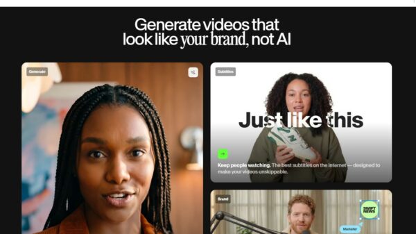
Claude Design takes text descriptions—natural language, no templates, no prompting magic required—and generates design assets. Not just images. UI layouts, presentation decks, social graphics, icon sets, simple website mockups. You describe what you want, it gives you something that looks like a professional designer made it in about two minutes.
That last part is what hooked me. I’ve tested enough AI design tools to know that “professional-looking” is doing a lot of work in that sentence. Most of them produce something that looks AI-made—which means it looks generic, slightly off, like a stock photo of people laughing at celery.
Claude Design doesn’t do that. The outputs have a texture I’m not used to seeing from generative tools. The layouts feel intentional. The typography choices make sense. Colors don’t clash in the way AI colors always seem to clash—bright for no reason, or muted into submission.
But—and this matters—it’s not designing for you. It doesn’t know your brand guidelines. It doesn’t know that you’ve used a specific shade of navy in every piece of collateral for six years. It doesn’t know that your CEO hates sans-serif fonts and will passive-aggressively mention it in every meeting.
What it knows is what you tell it. So if you write “make it look professional and modern,” you get something that looks professional and modern to it, which might mean something different than it means to your stakeholders.
The Part Where I Almost Gave Up
I almost quit on day two.
I asked it to generate a landing page for a project I’m working on—something I had clear references for. The first output was fine. The second was better. The third was what I actually wanted, but by then I’d spent forty minutes iterating because I hadn’t been specific enough in my original brief.
That’s the skill that matters with this tool: knowing what you want well enough to describe it. I don’t mean crafting perfect prompts. I mean understanding your own aesthetic well enough to articulate it. “Make it feel premium” is not a brief. “Clean whitespace, high-end serif headline font, product photography with depth of field blur, cool-toned palette with one warm accent—think luxury skincare brand” is a brief.
If you can’t write briefs, you can’t use this tool well. That seems obvious, but I’ve watched people blame AI for outputs that reflected exactly what they described, just not what they imagined.
The Actual Value (In Dollars and Hours)
Here’s what I keep coming back to:
Before Claude Design, the math for my small projects looked like this: either I spent four hours in Canva/Figma doing work I hated, or I spent $200-500 hiring someone, or I shipped something that cost me in credibility.
With this tool, I spend twenty minutes and what comes out is good enough to show a client. Not perfect—I’m still the one who decides if it’s right—but good enough that the conversation starts at “here’s our direction” instead of “please ignore the visual mess behind me.”
For quick-turnaround work—proposals, internal decks, social content, landing pages for pitches—this changes my economics. I can prototype visual directions in an afternoon instead of a week. I can show clients three options instead of one because the cost of making three is now twenty minutes instead of three hours.
I hired a designer friend to look at the outputs and give me an honest assessment. Her take: “If I saw these in a client presentation, I wouldn’t assume they were AI-generated. I’d assume someone had taste.” That felt like the right bar.
Who This Is Actually For
Not everyone. If you’re a senior designer at an agency, this might feel like a toy. You’re already fast. You’re already good. The gap this fills is smaller.
But if you’re anyone else—founders, marketers, product managers, freelancers, anyone who needs visuals but isn’t a designer—this is worth your attention. Not because it replaces design thinking, but because it handles the execution bottleneck that’s been costing you time and money.
The bar for “acceptable visual design” keeps rising. It’s not 2015 anymore, when a decent Word document could slide. Your competitors look polished. Your LinkedIn posts look polished. The half-second impression happens.
I still remember the morning I threw out those bad slides and almost threw out the deal too. I’d rather not be in that position again. If you’re in it often—stuck between “do it myself and cringe” and “spend money I don’t want to spend”—you don’t have to be anymore.
Independent tech publisher and AI enthusiast exploring the intersection of artificial intelligence, productivity, and online entrepreneurship.


Pingback: Notion vs Obsidian vs Capacities: The Ultimate 2026 Note-Taking Showdown - nextappszone